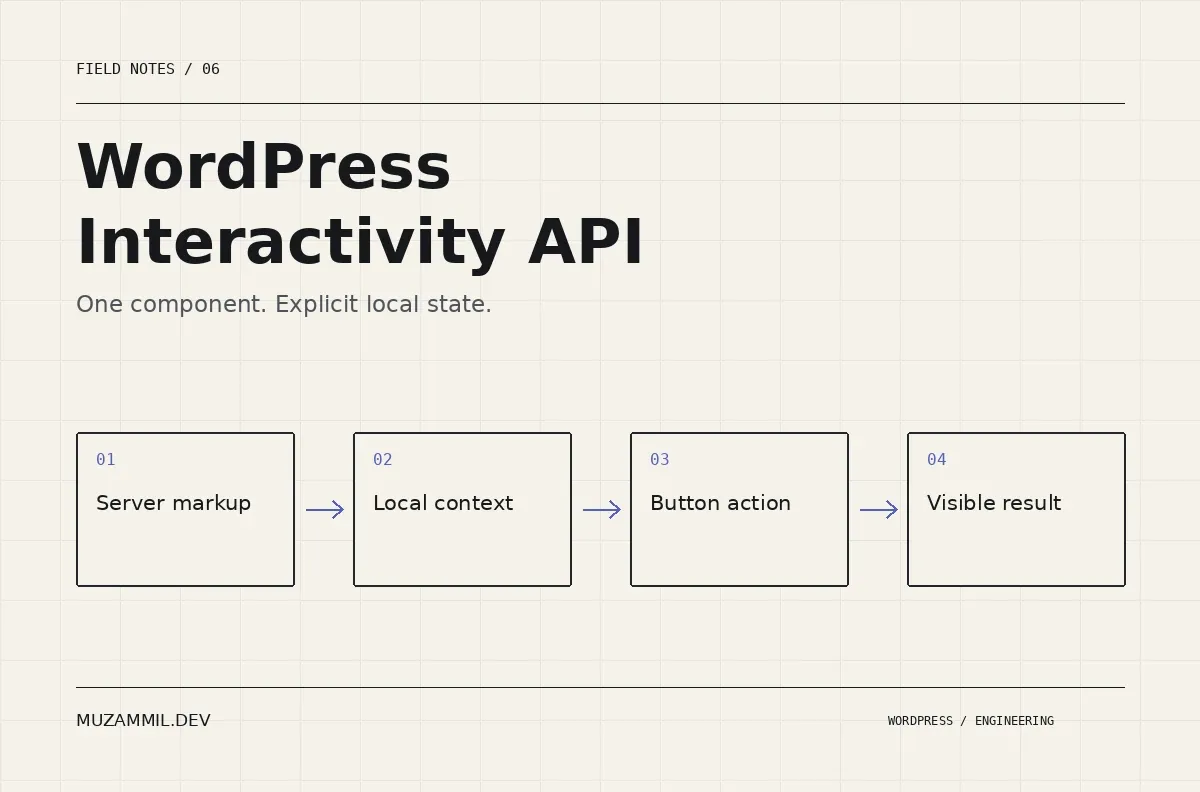
The WordPress Interactivity API gives block developers a way to connect server-rendered markup with frontend state. A useful first exercise is a disclosure: a button opens a small panel of additional information.
You could build the same interaction with a document-wide click listener. However, that shortcut becomes harder to manage when a page contains several instances, a plugin replaces part of the page, or two scripts try to control the same element.
This tutorial isolates the important pieces: a namespace, local context, an action and the attributes that reflect the current state. It is an implementation walkthrough for an existing development block, not a complete plugin ZIP. Use WordPress 6.5 or later and verify the build setup against the version you support.
First decide whether you need a custom interaction
For an ordinary expandable paragraph, the native Details block may already do the job. Prefer that when its behaviour fits the design. A custom block creates code you must maintain, so there should be a reason for it.
The example becomes useful when the disclosure is part of a larger component, such as a technical specification panel that later coordinates with other controls. Even then, begin with one clear action and avoid building a general-purpose interaction framework around it.
Write down the expected behaviour before coding. Each panel opens independently. The button remains a button. Its expanded state matches the panel’s visibility. Content remains understandable if enhancement fails. Those requirements will guide both implementation and testing.
Prepare a WordPress Interactivity API block
Use a registered block with a server render file and a frontend script module. The Interactivity API reference explains the required support declaration and script-module build setup.
The following fragment belongs in the block’s metadata. Merge it into your existing block.json rather than treating it as the whole file.
{
  "supports": { "interactivity": true },
  "viewScriptModule": "file:./view.js",
  "render": "file:./render.php"
}
Keep the existing block name, title, editor script and other required metadata. Also check the project’s build commands. A source file that imports a WordPress package is not necessarily a browser-ready file you can upload unchanged.
The block metadata handbook is the reference for registration and asset fields. Avoid copying configuration from a different plugin without checking how that plugin builds and registers its output.
Render a real control and a uniquely identified panel
The server markup needs a stable relationship between the button and the controlled panel. Generate a unique ID for each rendered instance so that several blocks can share a page without duplicate targets.
Here is a compact render.php example. The content is deliberately static so the state mechanics stay visible. A production block can add escaped attributes or appropriately rendered inner content later.
<?php
/** Render one independently controlled disclosure. */
$panel_id = wp_unique_id( 'mz-specification-' );
?>
<div
    <?php echo get_block_wrapper_attributes(); ?>
    data-wp-interactive="muzammil/specification"
    <?php echo wp_interactivity_data_wp_context( array( 'isOpen' => true ) ); ?>
>
    <button
        type="button"
        aria-expanded="true"
        aria-controls="<?php echo esc_attr( $panel_id ); ?>"
        data-wp-on--click="actions.toggle"
        data-wp-bind--aria-expanded="context.isOpen"
    >
        <?php esc_html_e( 'Technical details', 'muzammil-example' ); ?>
    </button>
    <div
        id="<?php echo esc_attr( $panel_id ); ?>"
        data-wp-bind--hidden="!context.isOpen"
    >
        <p><?php esc_html_e( 'Add the specification content here.', 'muzammil-example' ); ?></p>
    </div>
</div>
The panel starts open intentionally. If the frontend enhancement fails, the information remains visible. The button initially reports that same state. This is a modest progressive-enhancement choice, not an automatic accessibility guarantee.
Do not put a second interactive element inside the button. Also avoid using a clickable heading or a link with a fake destination as the control. Native buttons already support the expected keyboard activation behaviour.
Keep the state local to the component
The view.js module defines the action. It reads the context belonging to the current component and flips its boolean value.
import { getContext, store } from '@wordpress/interactivity';

/** Keep each disclosure's state in its own rendered context. */
store('muzammil/specification', {
    actions: {
        toggle() {
            const context = getContext();
            context.isOpen = !context.isOpen;
        },
    },
});
The namespace in this file must match the namespace in the markup. The directives and store documentation describes how directive references connect DOM attributes to state and context.
Notice what the example does not need: a querySelector that assumes one instance, an index stored in a global variable, or a click listener attached to every button on the site. That smaller scope makes the behaviour easier to reason about.
If the design later needs all panels to coordinate, model that requirement explicitly. Shared state and local context serve different purposes. Do not accidentally turn independent disclosures into an accordion by moving one boolean into a global store.
Preserve the hidden attribute’s meaning
The directive updates hidden as the state changes. Your CSS should not fight that behaviour by forcing every panel to display with an overriding rule.
For example, a broad component rule that sets display:block !important on all descendants can make a logically closed panel remain visible. Inspect the actual element when debugging. Check its hidden attribute, computed display and any animation classes before changing the JavaScript.
Also be careful with animated height transitions. They introduce additional states such as opening and closing. If you need that animation, design its focus and interruption behaviour rather than adding a transition to a component that only models open and closed.
For a first implementation, a clear instant disclosure is a better test of the architecture than a complicated animation.
Test more than one instance
Insert three blocks on the same development page. Give each different content. Toggle the middle one, then confirm the others stay in their expected state.
Next, inspect the generated panel IDs. The button’s aria-controls value should identify its own panel. Duplicate IDs can make the page appear correct while assistive technology receives an ambiguous relationship.
Then test keyboard use. Tab to the control, activate it with Enter and Space, and inspect the expanded state. If the panel contains links, confirm that closed content does not remain in the tab sequence.
Repeat with JavaScript unavailable or the module deliberately blocked on a test copy. In this example the panel should remain visible. If your actual requirement needs a different fallback, document it and test that version deliberately.
Know what the WordPress Interactivity API does not secure
Hiding content is presentation. It does not protect private records that the server already sent to the browser. If a panel contains customer data, the server must authorise access before rendering it.
The same rule applies when the component later requests data. Add server-side capability checks, validation and appropriate request protection. A disabled button or a hidden panel cannot replace those checks.
Also avoid storing secrets in context or HTML attributes. The browser can read them. Context is convenient state for rendering behaviour, not a safe place for API credentials.
These boundaries matter because an initially harmless disclosure often grows into a quote tool, account panel or filtering component. Keep the state model small, but keep the trust boundary explicit.
Debug the rendered page, then the build
If nothing happens, first confirm that the saved page contains the expected namespace and directive attributes. Then confirm the frontend module loads without an import or runtime error.
After that, check the registered block metadata and generated build files. An incorrect path or an old asset can look like an API problem. Test with the normal optimisation plugins enabled too, because script handling may differ from your clean development environment.
For a larger client build, the block-theme governance article explains how reusable components fit into editorial ownership. If you need a custom interaction reviewed, send the component and its expected behaviour.
The WordPress Interactivity API is most useful when it makes the relationship between markup and behaviour clearer. Begin with one component whose state you can explain, then extend it only when the product requires more.


